Feature :
By Admin posted on June 20, 2014
At what point exactly, I wonder, did infographics turn the corner from being the holder of scientific or mathematical data, and process charts to ‘so unbelievably cool?’
I mean, it’s nothing new. I’ve read a start date of 17th Century, but surely there were battle maps and scientific scribblings proceeding that time? When words, arrows and boxes might all have appeared on one piece of paper? Anyhow, infographics… great. So great, and so needed that they invented clip art! To allow us all to use images to explain complicated things in a more simplistic way. After all, a picture speaks a thousand words… providing – of course – it’s the right picture.
Personally, I love infographics. I’ve always hidden my envy in every agency I have worked in, watching the planners take my endless streams of consciousness and put them into one, beautiful slide. In Powerpoint. Or Keynote. What would we be without boxes and arrows, and icons to show databases? How much harder would it be to set up our work if all we had was words? But this is not infographics at it’s finest. However competent the planner, however flexible the off the shelf design package.
The publishing world, once guilty of a shoot too many, and carrying the burden of an excessive bill for stock photography are now using them more and more. In last month’s Monocle they accounted for around 63% of all imagery used. Magazines like Icon, and papers like the FT have even used them for lead front cover imagery. Earlier this month CreativeBloq released a top ten free tools to create infographics, in January, Shutterstock announced a rise in downloads of flat UI-inspired design having seen a 200% increase last year. They’ve now added another 170,000 relevant assets to their collection.
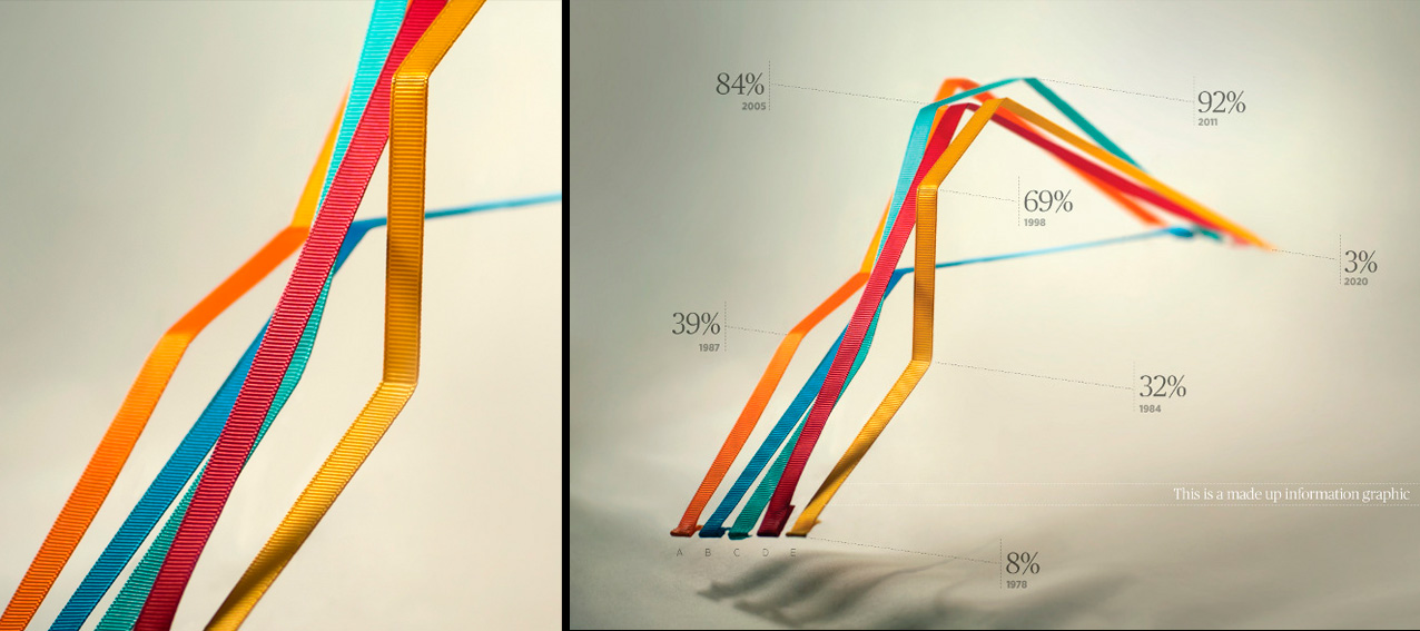
But decent infographics are a true art form. Just take a look at the work of Tim Leong over his career (especially the days at Wired), culminating in his book Super Graphic: A Guide to the Comic Book Universe. Not seen it? Buy it. Today. Charles Williams (yes, he’s one of our partners) is a fine example of infographic artist with an emphasis on ‘artist’ who not only hand produces in three dimensions, but also uses multimedia production techniques to achieve his fantastic style. And if you’ve not yet seen the incredible work of Nearly Normal, check out their website and see how the world of infographics has inspired their team. Truly brilliant.
Infographics are everywhere. Quite simply, they’ve become an absolute necessity in the communications world today. Now living our lives consuming more information by the minute, served to us in bullet points, in tweets, and in pop ups, speed of thinking and speed of understanding is critical. We’re multi-tasking typists needing to observe and absorb at the speed of light. And a great infographic allows us to do just that.
And now, as we trundle through February, we see the shelves adorned in a swathe of hearts and roses now being the latest domain for infographics.
Infographics…we Heart You